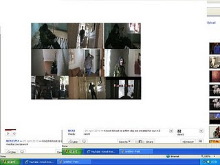
The title of the film - we decided to name our film 'knock knock' after much thought and deliberation. We chose this because it is a short and catchy title for the film that we hope would entice the audience into watching it. It also fits in extremely well with the actual storyline, as the killer in the film knocks on the door before killing the victim. This is the main reason why we chose to name our film 'knock knock'
Setting/location - we filmed at a member of our groups house as it suited our storyline and genre. It is quite a small house which we felt would help in creating quite a tense and eery atmosphere. This was therefore perfect for our opening scene which sole purpose is to keep the audience on edge. Horror films often start in someones home with a murder for example the film 'Scream'.
Costumes and props - The killer was wearing a ice hockey mask covered in blood stains. He was also wearing an army jacket with dark jeans. The mask is crucial as it helps to cover up the real identity of the killer, therefore the audience will carry on watching the whole film to find out the killers identity. We felt that the mysterious characteristics of a killer is used in a lot of horror films, therefore we thought that we would use this technique.
The victim was dressed fairly casually as he was coming back after a night out at a party. We wanted the victim to look a bit drunk and dis-orientated as we felt this would make him look more vulnerable to the audience.
The knife was the main prop that we used as it was used for the murder scene. Again a stabbing scene is used in many horror films for example 'Halloween'
Camerawork and editing - We used a handheld cam for a scene in the film, as we were trying to get the audience to be on edge as we were filming from the killers point of view. We also used canted angles when filming the victim as we wanted the audience to see that he is in danger, and again to create a tense mood. The editing is fairly simple, as we were just trying to cut between the killer and the victim through the use of continuity editing. This was to show the audience the link between the two characters.
Title font and style - We used a bold font, coloured in red. This is because red has connotations of danger and death therefore it fits in perfectly with our film.
Story and how the opening sets it up - The opening sets up the whole story perfectly as the story is that the killer commits murders constantly in the same fashion as what happened in the opening scene. This therefore sets the audience up perfectly for the rest of the film.
Genre and how the opening scene suggests it - We have tried to use all the media techniques including camerawork, sound, mise-en-scene and editing in the opening scene to create a tense and eery atmosphere to the audience to show this is an horror film.
No comments:
Post a Comment